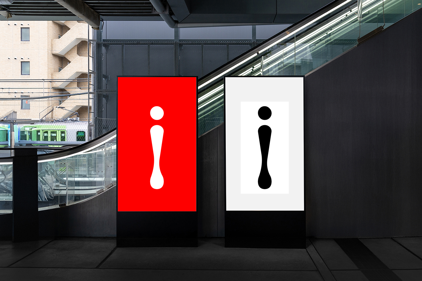
Design
Inhous
Creativity doesn't have to be far from home.
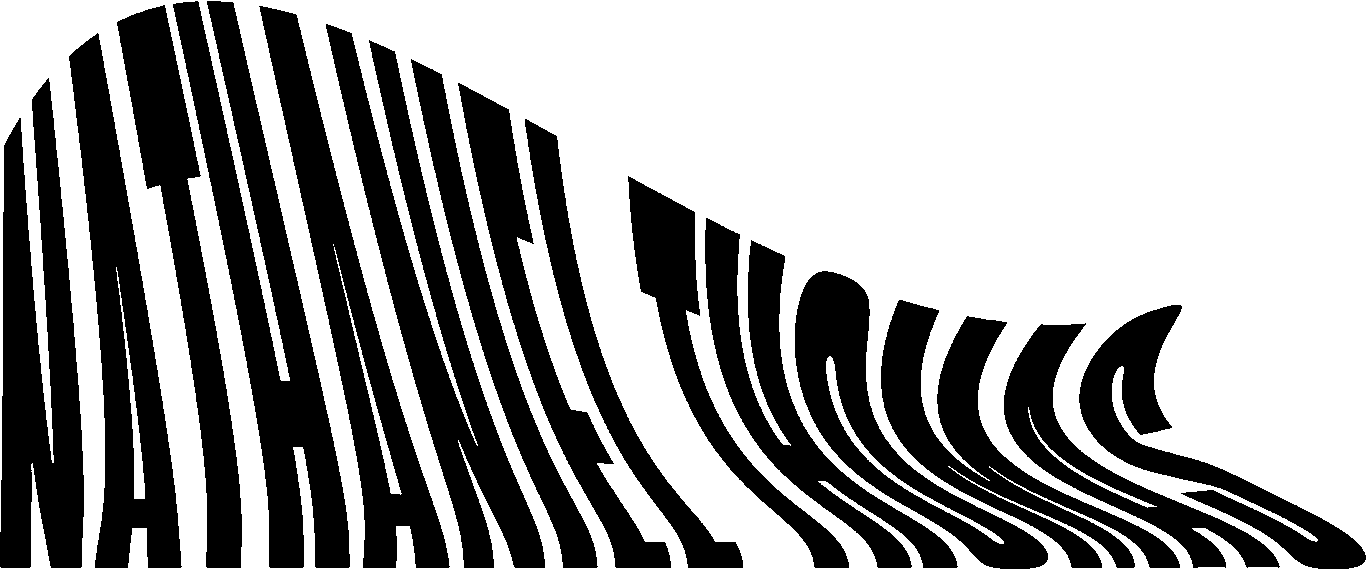
Project Role
Creative Director
This is a brand identity for a fictional design agency called Inhous. The name is a play on words regarding designers working as a freelancer, with an agency, or working in house for a business. It's supposed to make people think that even though we're a separate entity we still collaborate and work with you just the same as if we weren't. Inhous is about collaboration, creativity, and harmony. Working as one to make the same goal happen.

Adobe Illustrator